
Book Cover Trends – Great Design Across Select Koehler Books by Carol Van Den Hende, MBA
Despite the well-known saying “you can’t judge a book by its cover,” readers often shop with their eyes. Humans seem to be wired this way. “More than 50 percent of the cortex, the surface of the brain, is devoted to processing visual information,” points out Williams, the William G. Allyn Professor of Medical Optics 1 .
I love how visuals can evoke varying emotions. During my twenty+ year career in marketing and strategy, I adored partnering with some of the world’s top design agencies, guiding their work with briefs. selecting designs, and attending photo shoots. These collaborations resulted in new designs and changes to billion-dollar brands, with satisfying market share growth.
So, it’s natural for me to assess book cover designs, and they can be as beautiful as art.
As I’m preparing to speak about book cover design at IBPA’s Publishing University, I’ve been perusing Koehler Book’s covers, whose authors I count among my friends. Many in the portfolio are great examples of design delivering breakthrough, being consistent with a book’s promise, and understanding genre expectations.
Here are some trends I noticed, but as with art, design assessment is subjective!
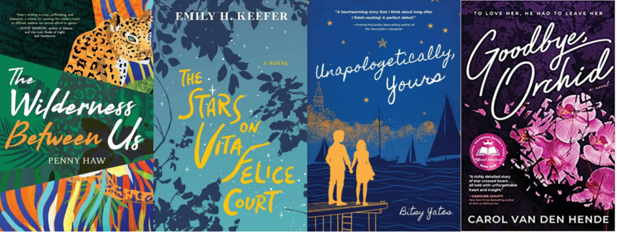
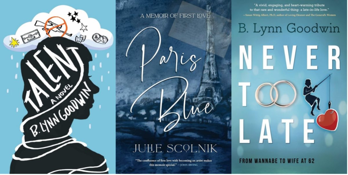
1) INTIMATE PERSPECTIVE. Fiction books provide a close perspective from protagonists’ points of view. To create this feeling of intimacy in the cover, some covers are using hand-drawn fonts. This can help a story feel personal and approachable. Do you get this feeling from any of these covers? (and yes, my debut, Goodbye, Orchid, is included!)
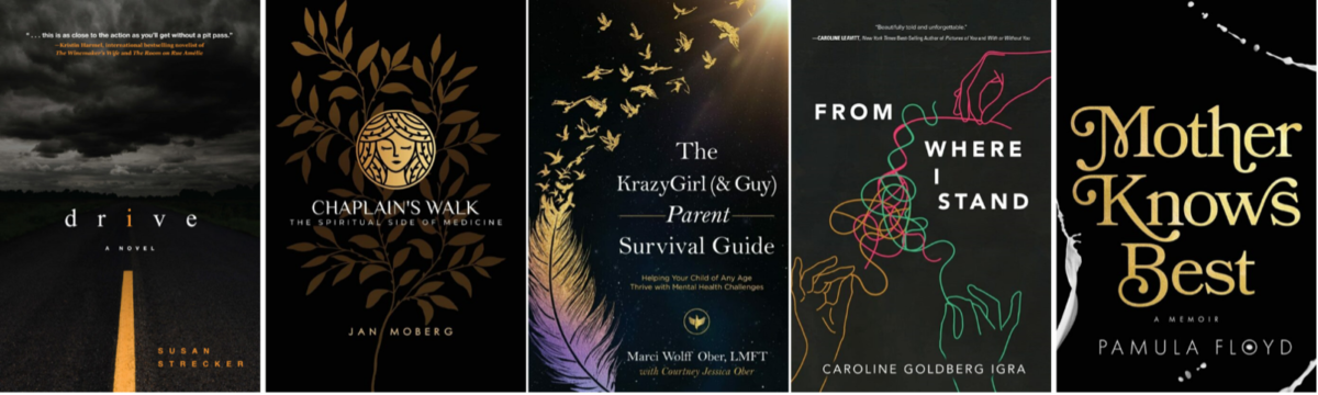
2) SOMBER, ELEGANT MYSTERY OF BLACK AND GOLD. In contrast, some books employ a black background which can give a moody, dark feel. Coupled with gold, this can provide a refined yet mysterious air. The organic elements like leaves, a sky, feathers and birds offset what could be an ominous tone with a touch of life.
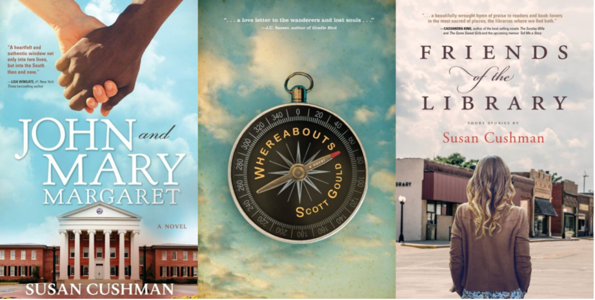
3) EXPANSIVE SKIES. Speaking of skies, this element can add visual depth to a two-dimensional cover. Do you sense the feeling of expansiveness from the sky backdrop on the covers of Friends of the Library, Whereabouts, or John and Mary Margaret? It’s a brilliant way to invoke perspective.
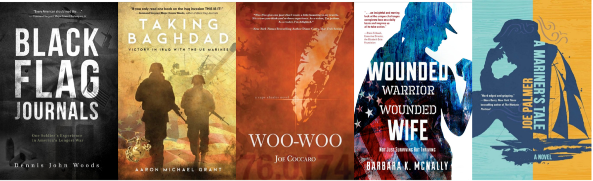
4) MULTI-LAYERED. Another subtle design approach is the “double take.” Here, the reader gains additional visual information on a second glance. Many of these covers use an ethereal background with another image superimposed on it. Notice how several of these are war memoirs which suit the haunting feel of these designs.
5) POWER OF COLOR. There’s a whole science behind color theory. For example, some say that blue is a color of hope, that captures the expansiveness of overhead skies. These covers leverage the hue into a feeling of potential, with a touch of wistfulness:
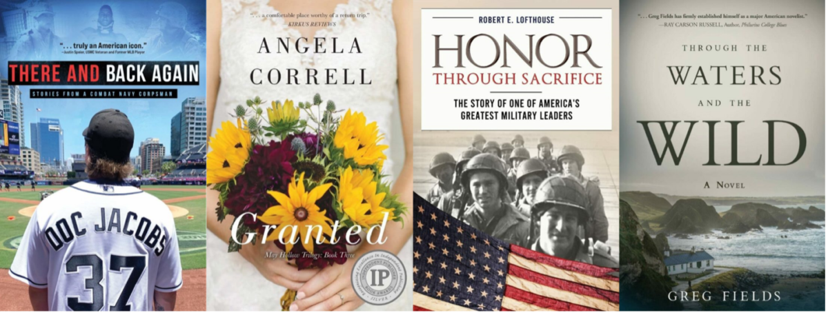
6) REALISM. In contrast to the illustrated images above, some covers use realistic photography which grounds the reader in a real moment and place. In addition, the below covers use serif fonts (the versions with extra strokes that finish off the letter’s stem). Serif fonts are more conservative than the cleaner, sans serif fonts, and can connote tradition or gravitas.
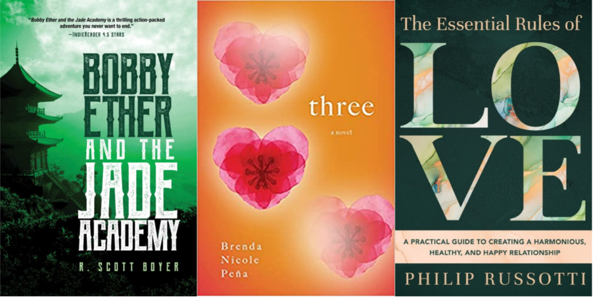
7) GRAPHICAL ILLUSTRATIONS. One final style to contemplate are the graphical illustrations below, which are sometimes paired with a color wash. This can create bold, fanciful and varied looks:
Remember, none of these are “right” or “wrong.” Book cover assessment is more about the fit of the cover to convey the book’s promise to the reader, and as with all art, is highly subjective!
If you’ve enjoyed this trend review, please keep the conversation going by connecting with me at https://carolvandenhende.com
 CAROL VAN DEN HENDE is the award-winning author of Goodbye, Orchid which has won 16 literary and design awards. She’s also a public speaker and MBA with 20+ years’ experience in marketing, strategy and insights. Carol is passionate about simplifying marketing concepts into actionable steps for publishing success. She’s keynoted and presented at conferences like Writer’s Digest, International Women’s Writing Guild, Rutgers Writers’ Conference, Sisters-in-Crime and Novelists’ Inc. She’s also a regular contributor to DIYMFA, where she pens the Author Marketing Toolkit column. You’ll find Carol’s impact, talent and tenacity in multiple areas. She’s passionate about conservation, and respect for human, social and natural capital. She speaks publicly as a Climate Reality Leader, been named Disability Hero of the Year by corporate disability inclusion firm Springboard Consulting, and serves on Boards of Directors. One secret to her good fortune? Her humorous husband and teenaged twins, who prove that love really does conquer all. Please sign up for Carol’s newsletter at carolvandenhende.com/contact
1Source: https://www.rochester.edu/pr/Review/V74N4/0402_brainscience.htmlABOUT THE AUTHOR